A Beginner’s Guide to Color Theory (And Why It’s Everywhere Around You)
You don’t need to be an artist to understand color.
You’ve been feeling it your whole life.
-
Why do hospital rooms often feel cold and impersonal? (Hint: it’s the dull greys and fluorescent whites.)
-
Why does a cozy café feel instantly warm and welcoming? (It’s not just the coffee—it’s the earthy browns and warm lighting.)
-
And why do some homes feel peaceful while others feel chaotic?
That’s color theory in action—quietly shaping our emotions, decisions, and spaces without us even realizing it.
Let’s break it down in the simplest way possible, and explore how it connects to the way we decorate our homes—especially with meaningful art.

🎨 So, What Exactly Is Color Theory?
Color theory is the science and emotion behind how colors work together.
It helps artists, designers, and even stylists decide what colors to pair for a balanced, beautiful effect.
At its core are three types of colors:
-
Primary: Red, blue, yellow – the source of all other colors.
-
Secondary: Green, orange, purple – made by mixing two primaries.
-
Tertiary: Combinations like blue-green, red-orange, etc.
These are laid out on a color wheel, and when you understand how colors are placed and connected, you unlock the ability to create harmony in any space.

🧠 Why Does It Matter? Because Color = Emotion
Colors don’t just decorate—they communicate.
Here’s how different colors tend to make us feel:
|
Color |
Emotion/Effect |
Best Used In... |
|
Blue |
Calm, trust, stillness |
Bedrooms, meditation corners |
|
Green |
Renewal, peace, nature |
Living rooms, wellness areas |
|
Red |
Energy, passion, warmth |
Dining rooms, statement corners |
|
Yellow |
Joy, optimism, light |
Kitchens, reading nooks |
|
Pink |
Softness, nurturing, love |
Kids' rooms, feminine corners |
|
Black/Grey |
Depth, sophistication, power |
Modern or artistic focal points |
|
White/Cream |
Openness, calm, clarity |
Any base for layering other tones |
Color theory helps you intentionally choose what kind of feeling you want a room (or a wall) to create.
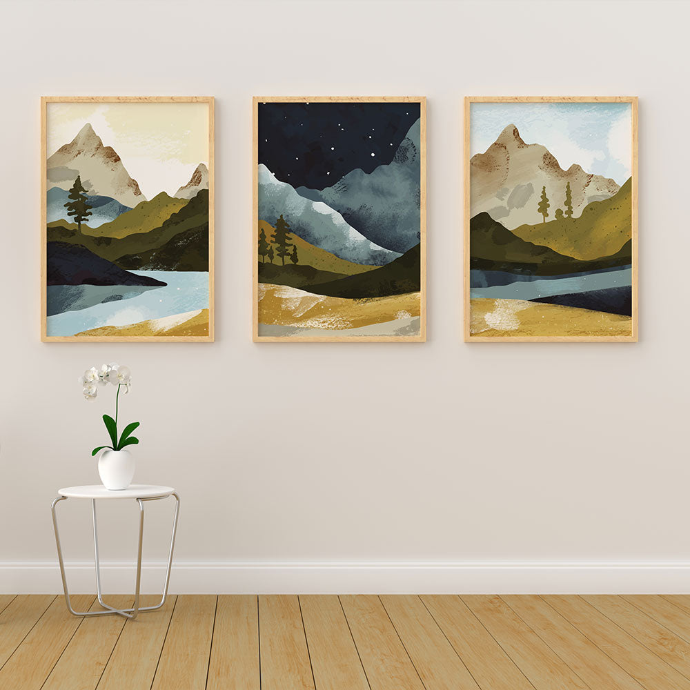
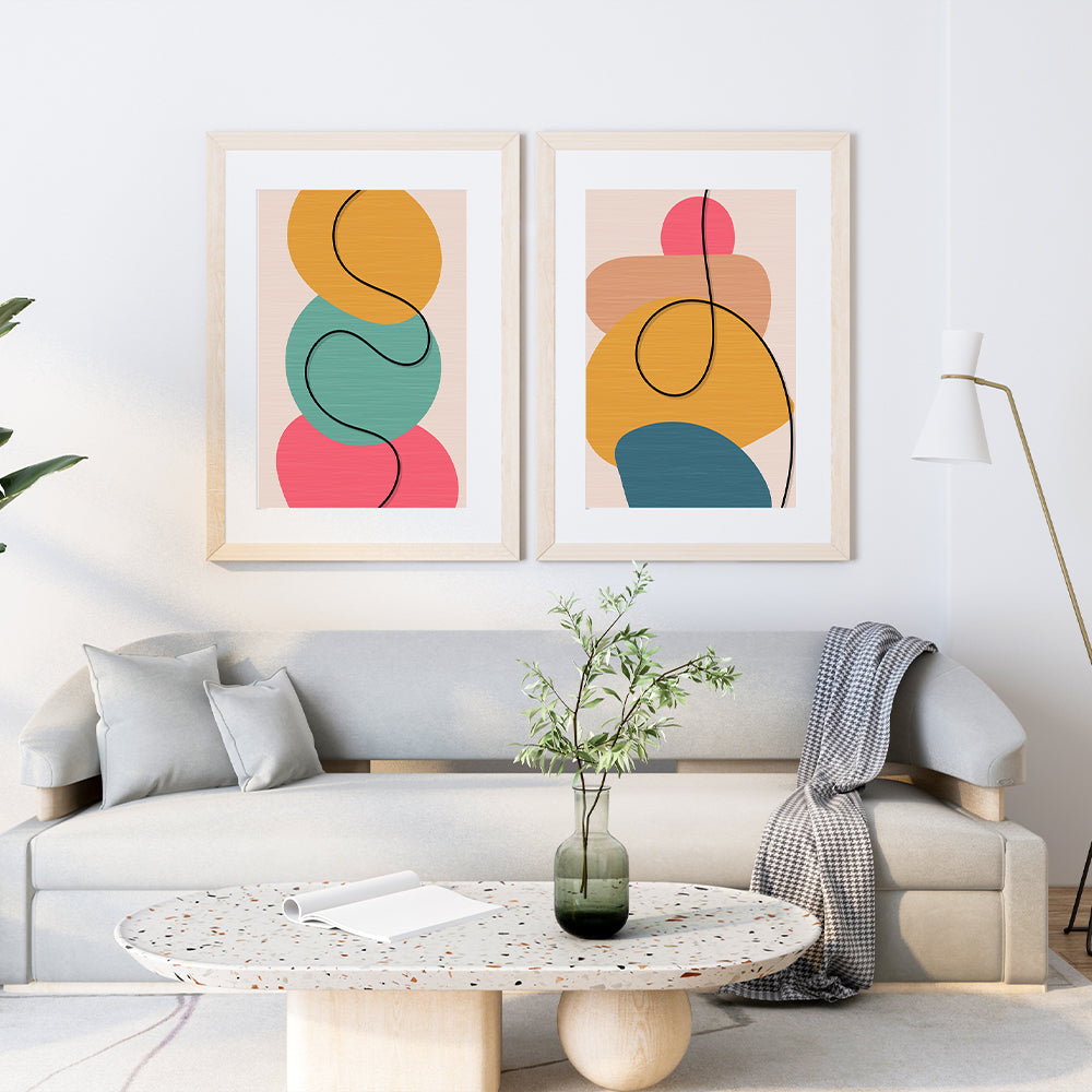
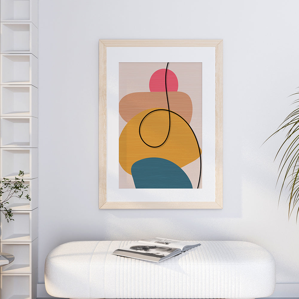
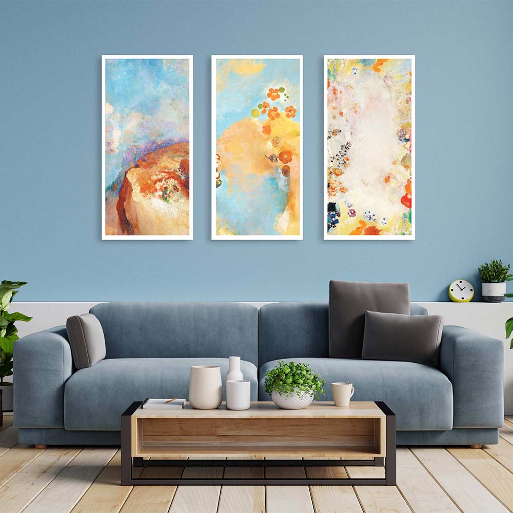
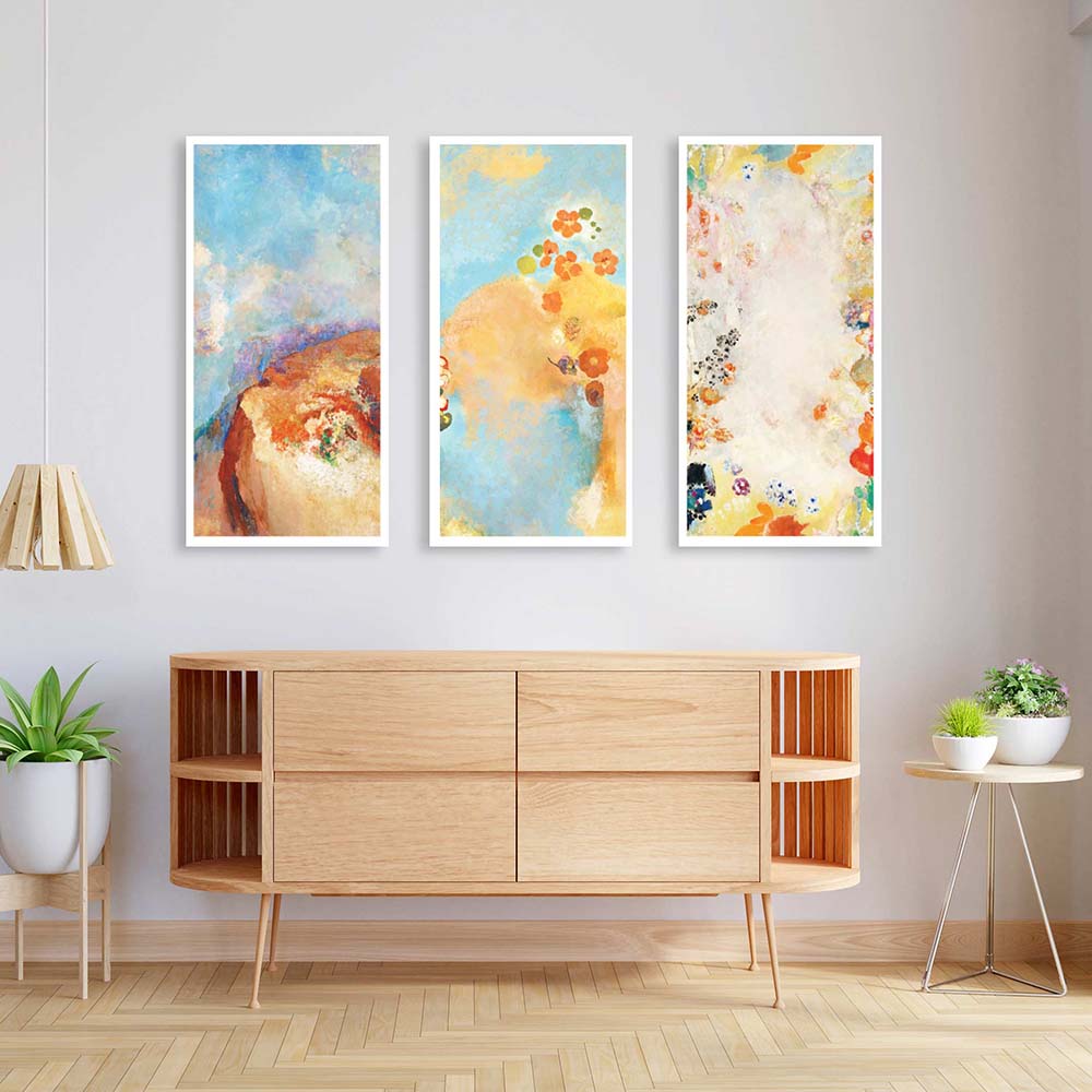
🖼️ How Artists Use Color Theory to Create Art That Feels ‘Right’
When you look at a painting and it just feels balanced, that’s color theory working quietly in the background.
Great art is not just about technique—it’s about knowing how:
-
Warm and cool tones interact.
-
Light and shadow play with emotion.
-
Contrast and harmony guide the viewer’s eye.
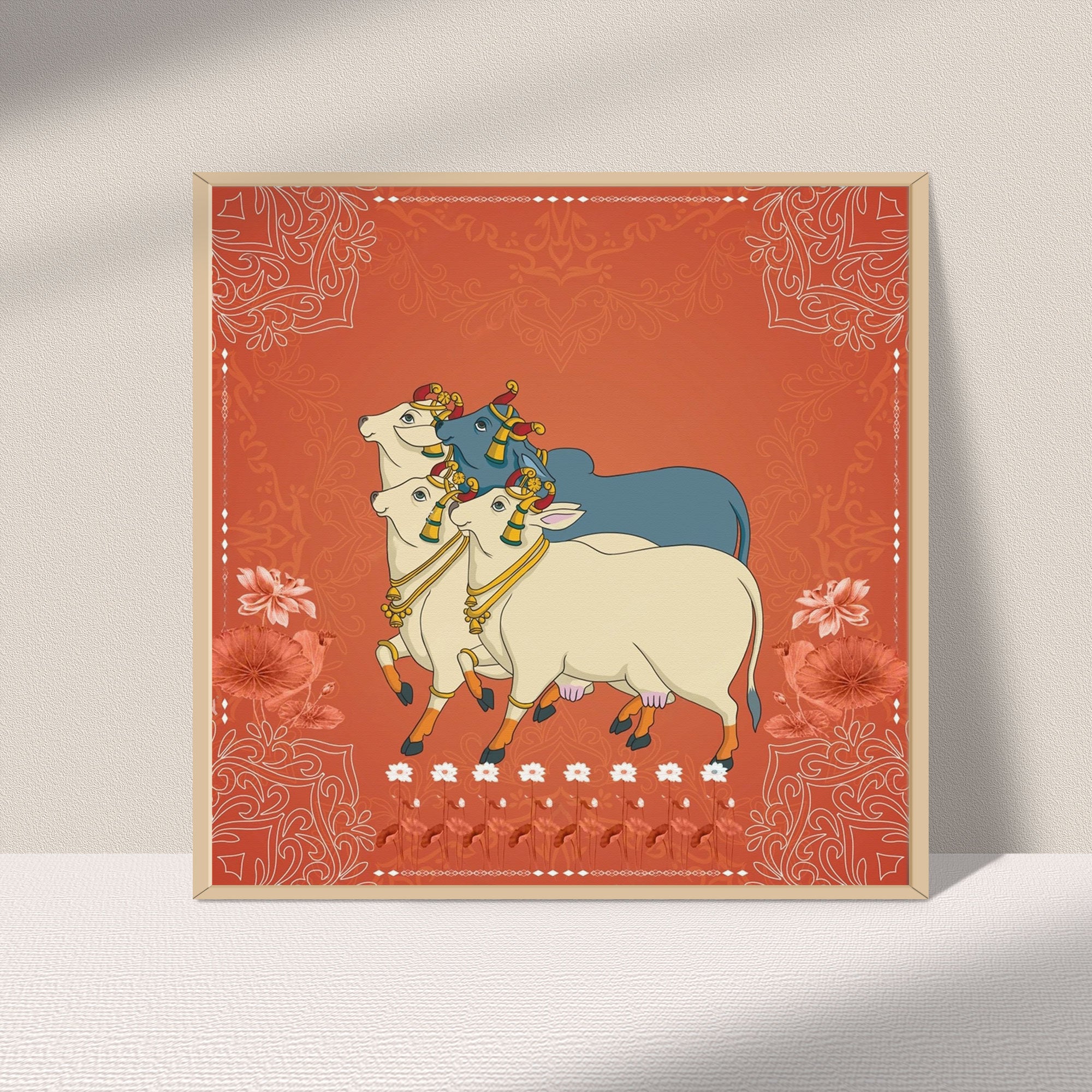
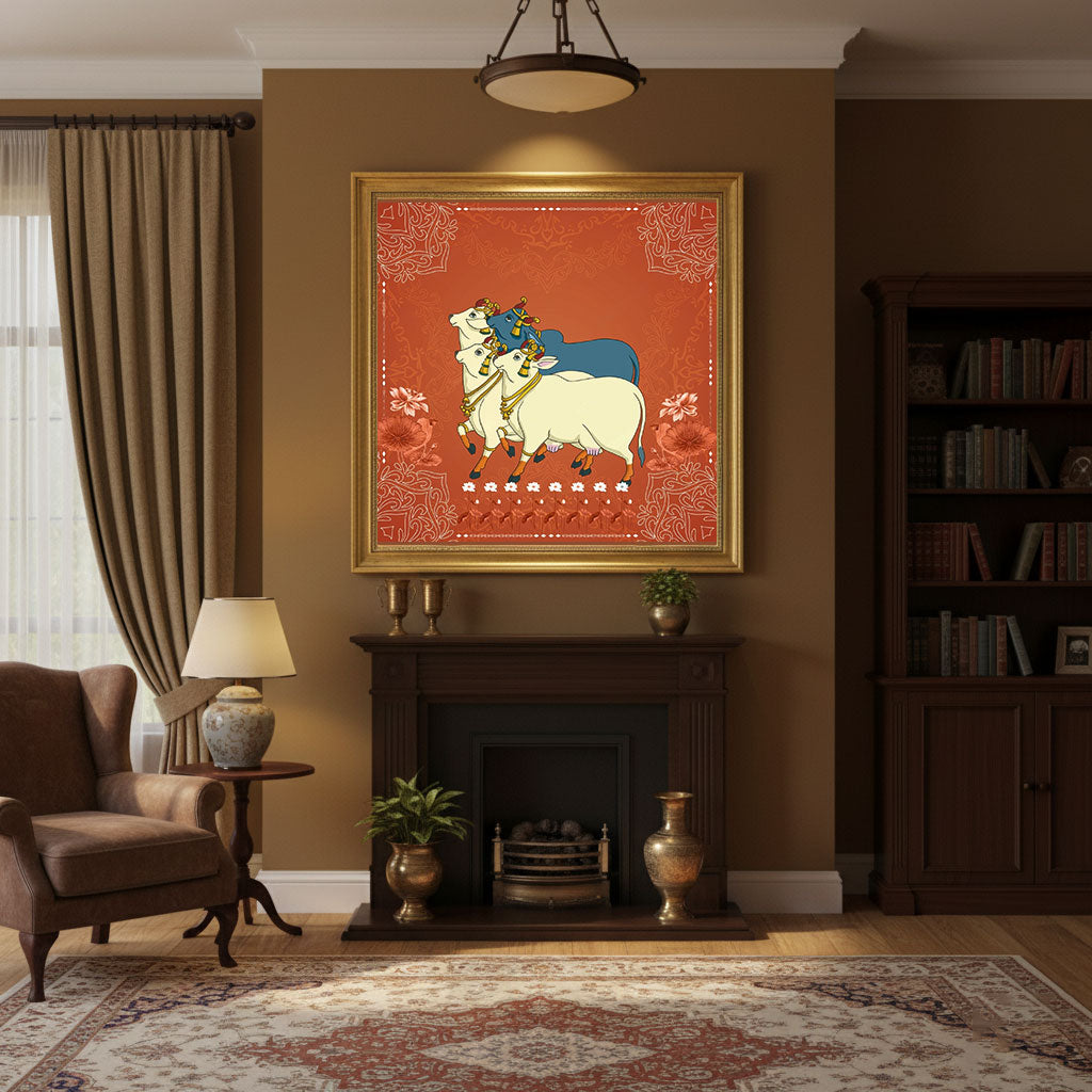
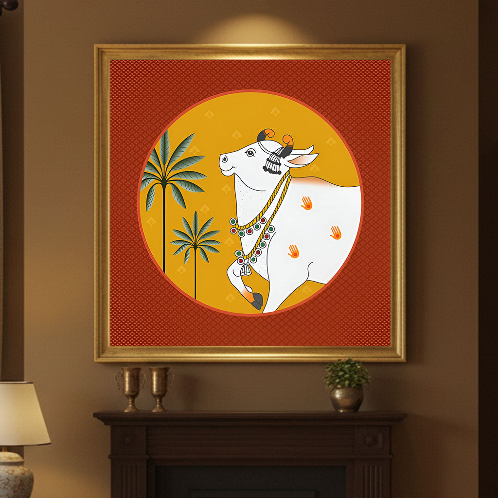
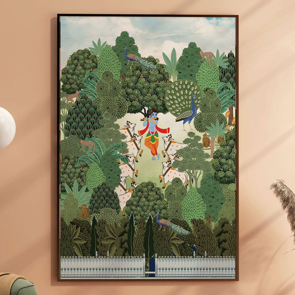
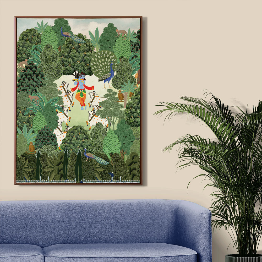
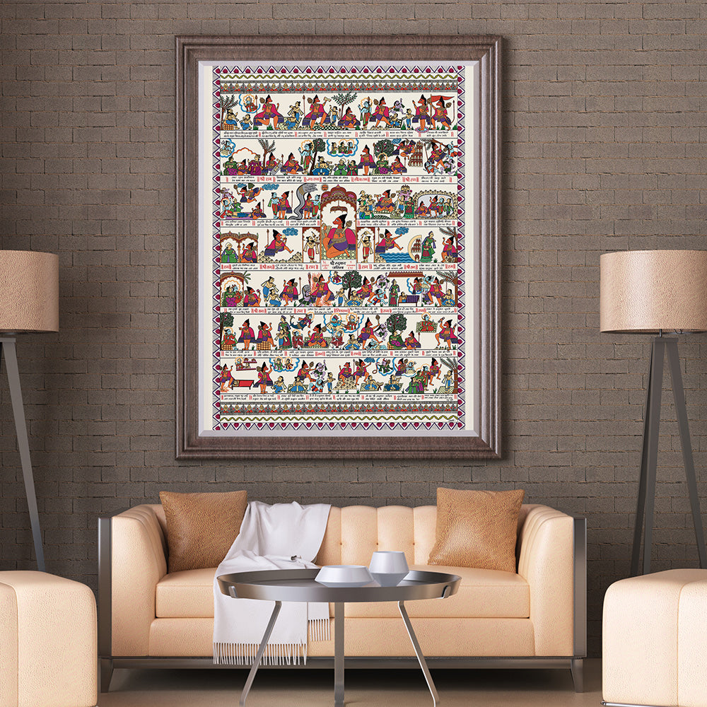
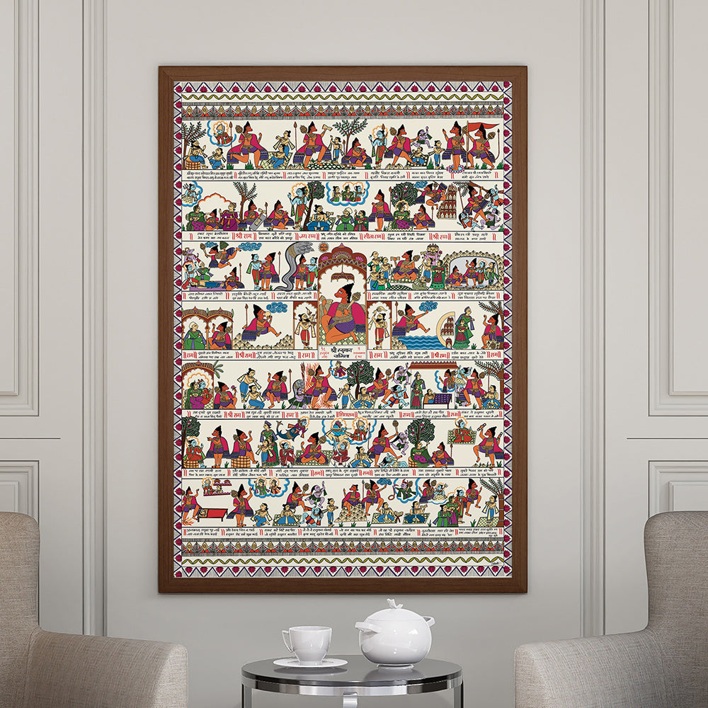
At Krutik, every collection is built on these principles.
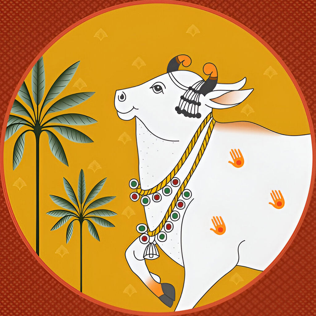
Whether it's the muted balance in a mandala, the sacred vibrancy in a Pichwai, or the emotional expression in an abstract, the color choices are always intentional.
We don’t just create art. We create feeling on canvas.

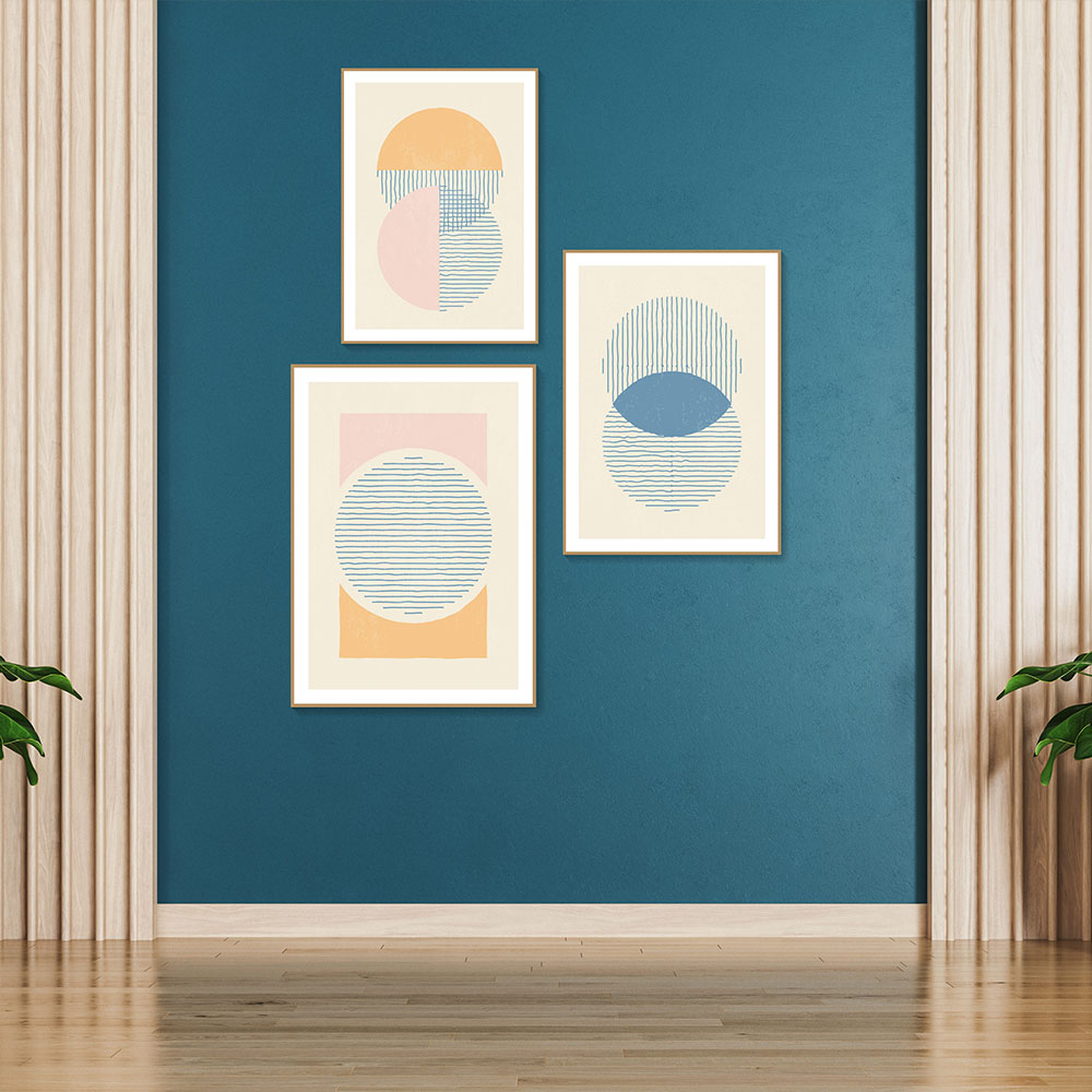
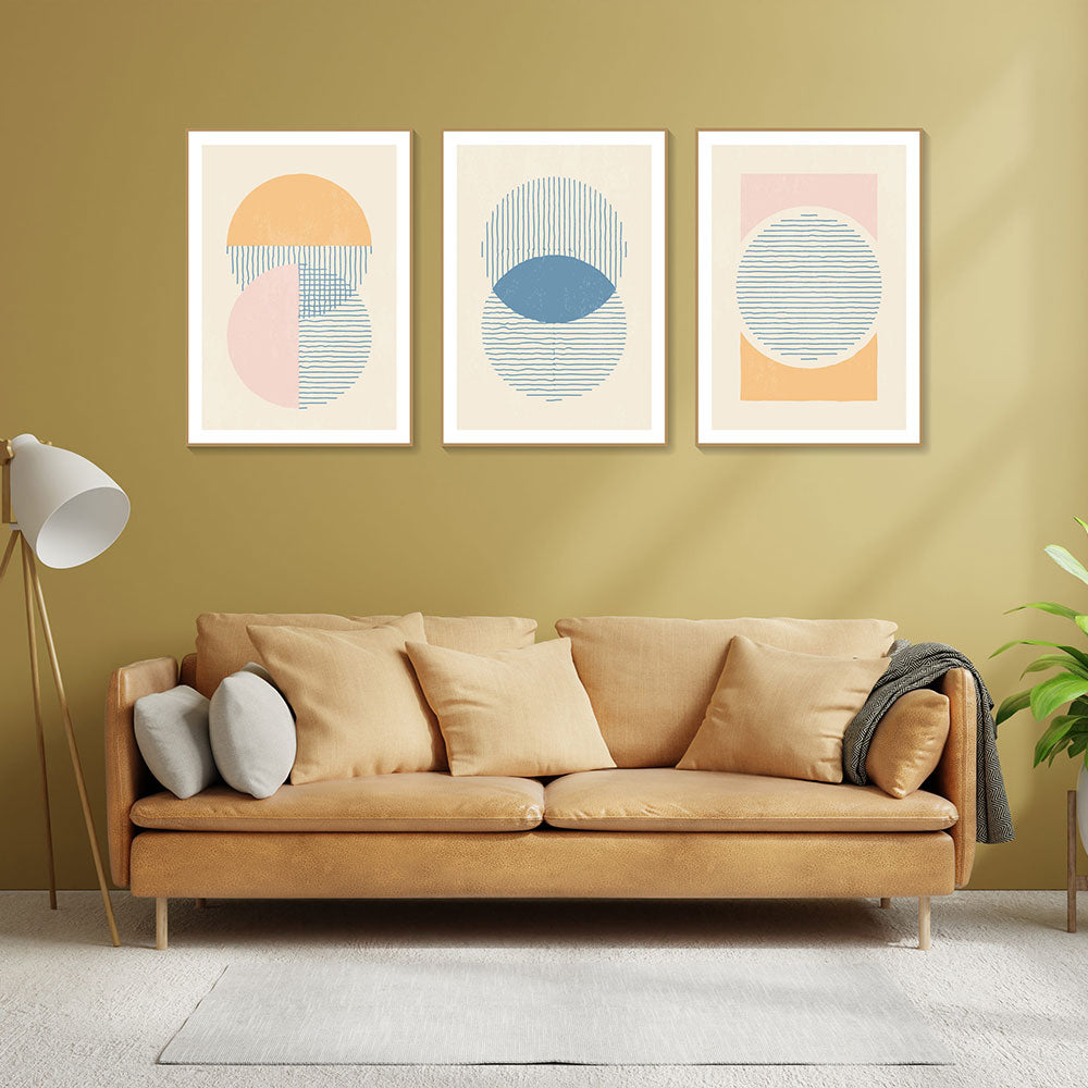
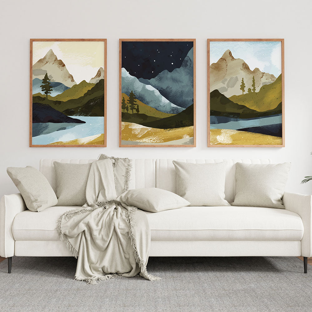
🌈 Tips for Beginners: Using Color Theory at Home
You don’t need to memorize the color wheel—just start noticing.
Here are a few easy ways to apply color theory when decorating:
-
✔️ Stick to Analogous Colors (those next to each other on the wheel) for a calm, cohesive look.
-
✔️ Use Complementary Colors (opposites like blue & orange) for energy and contrast.
-
✔️ Balance Bold Shades with Neutrals so the space doesn’t feel too loud.
-
✔️ Match Mood to Color – if you want peace, go for cool tones. For stimulation, warm tones work better.
-
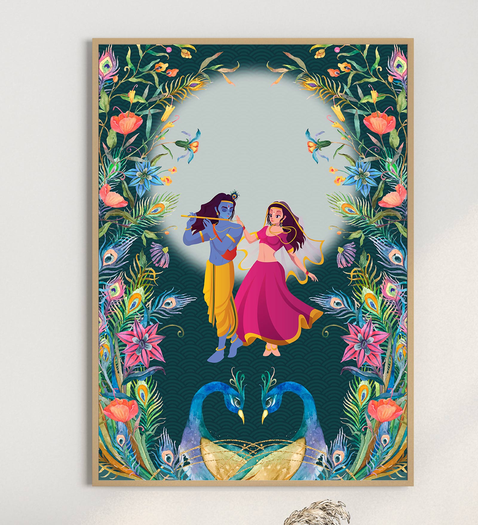
✔️ Let Your Art Anchor the Palette – Pick one dominant color from a painting and build your room’s palette around it.

🌟 Why It All Comes Together with Krutik
Color is at the heart of everything we do at Krutik.
We believe that art should not only beautify your home—it should balance it emotionally.
Our curated collections use color theory to bring:
-
Calmness to your meditation space.
-
Warmth to your living area.
-
Playfulness to kids' rooms.
-
Strength to your sacred corners.
Each artwork is designed with love, intuition, and an understanding of how color can quietly transform a wall—and your mood.