How Color Theory Can Transform a Blank Wall into a Masterpiece
A blank wall is full of possibility—an untouched canvas that can either feel empty and cold or alive and inspiring. What makes the difference?
It’s not just what you put on it.
It’s how color speaks on it.
That’s the power of color theory—the silent language that artists, designers, and stylists use to transform ordinary spaces into deeply emotional, aesthetically balanced homes.
Whether you're styling a cozy apartment corner or designing your dream meditation room, understanding color theory helps you turn blank walls into visual stories.
🎨 What Is Color Theory, Really?
At its core, color theory is the science and emotion of how colors interact.
It explains:
-
Which color combinations feel natural.
-
Which evoke contrast or tension.
-
And how they influence our feelings in a space.
It’s not just about “what looks good.”
It’s about creating visual flow, balance, and energy—intentionally.

🧠 The Emotional Science of Color
Colors carry frequency. They impact our psychology—even before we’re aware of it. Here’s what different tones can feel like on a wall:
-
Warm tones (reds, oranges, yellows) → energizing, joyful, stimulating.
-
Cool tones (blues, greens, purples) → calming, soothing, introspective.
-
Neutrals (beige, white, grey) → grounding, minimal, open.
-
Dark shades (charcoal, deep blue, maroon) → dramatic, cozy, rich.
-
Pastels → gentle, nostalgic, soft.
When artists create with color theory in mind, they’re not just filling space—they’re shaping mood and meaning.
🌀 Why It Matters in Home Decor
Your wall is often the emotional anchor of the room.
If you cover it in colors that clash with your energy or overwhelm the room’s vibe, something always feels "off."
That’s where color theory becomes your best friend. It helps you:
-
Choose the right art for the right space.
-
Create flow from one corner to the next.
-
Match your mood to your material (without guessing).

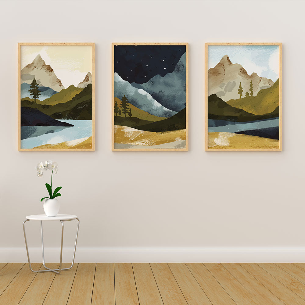
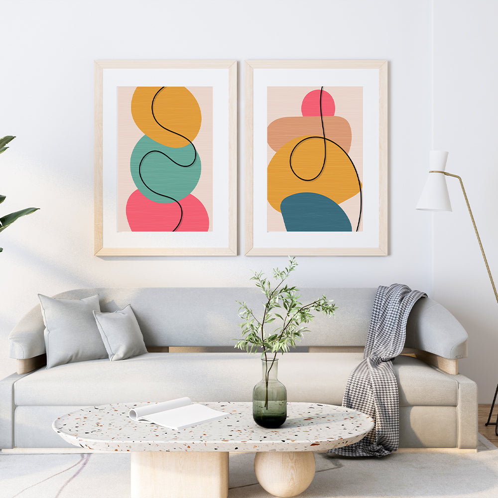
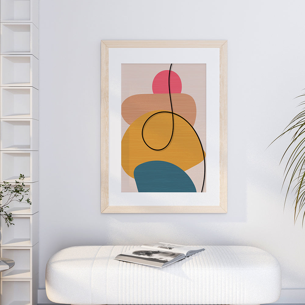
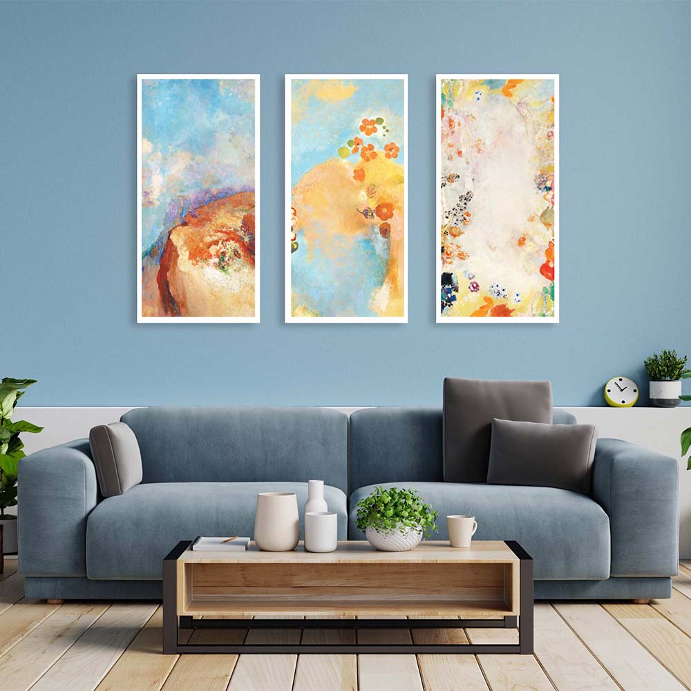
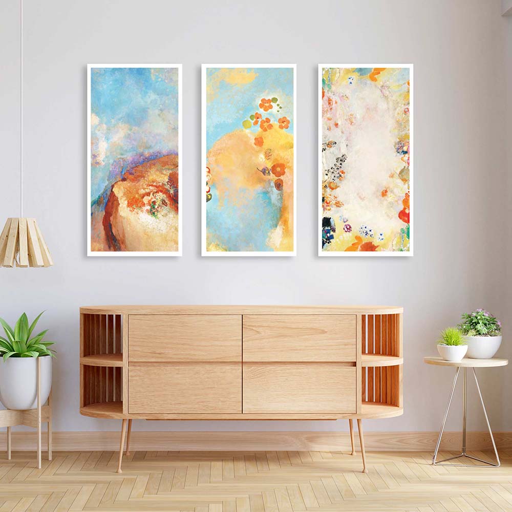
🖼️ Turn Blank Walls into Masterpieces with Art
Let’s say you have a white or beige wall.
Instead of painting it a new color or covering it with clutter, you can elevate it with art that uses color strategically:
💚 Calming Mandalas
Muted greens, soft blues, and symmetrical flow for meditation corners or bedrooms.
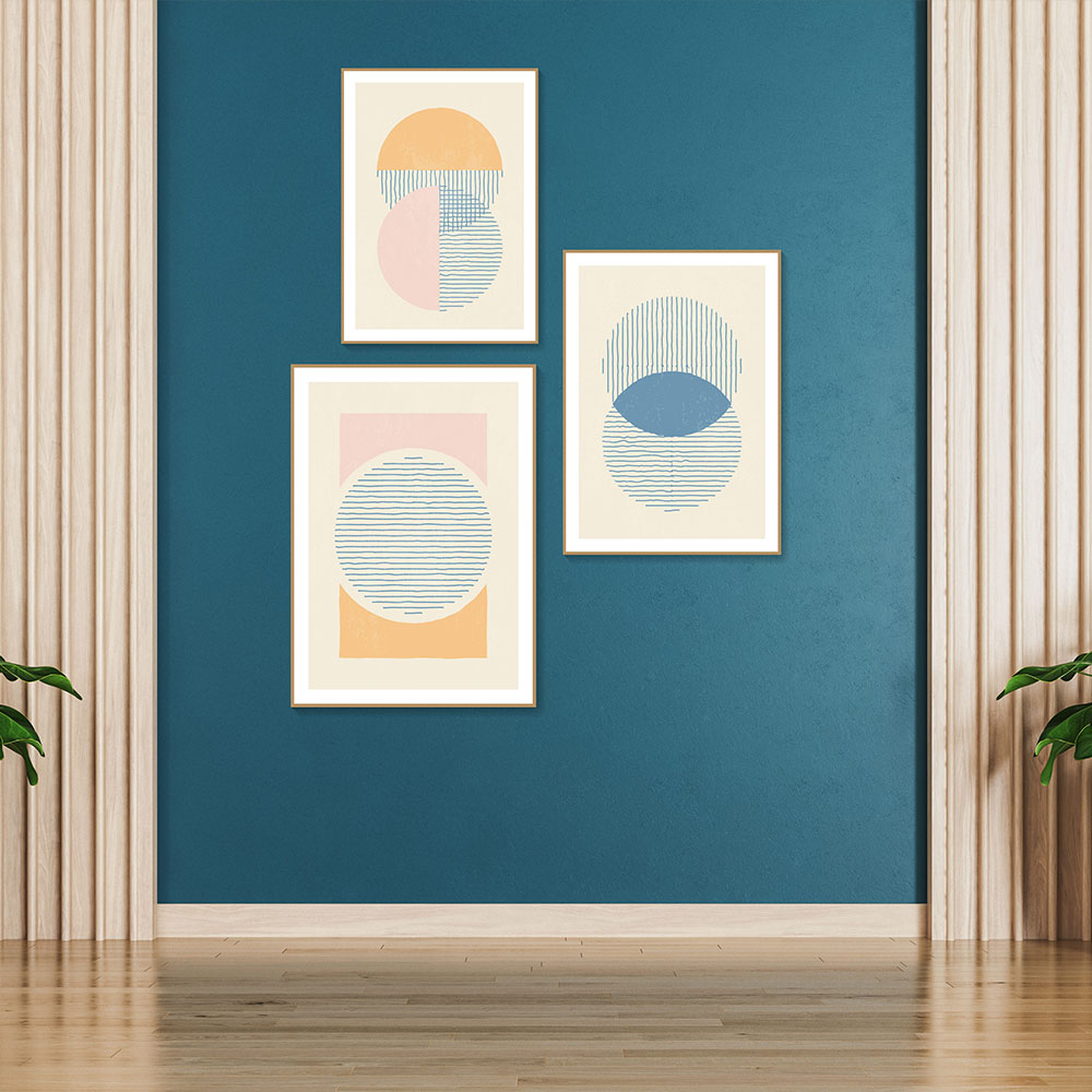
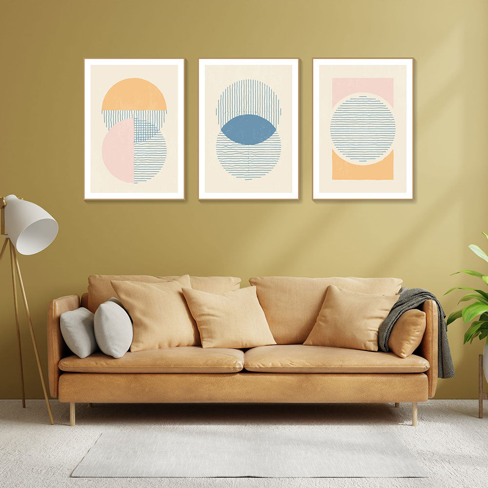
💫 Celestial or Abstract Art
Moody indigos, cosmic blacks, and touches of gold or white to add drama and mystery—perfect for accent walls.
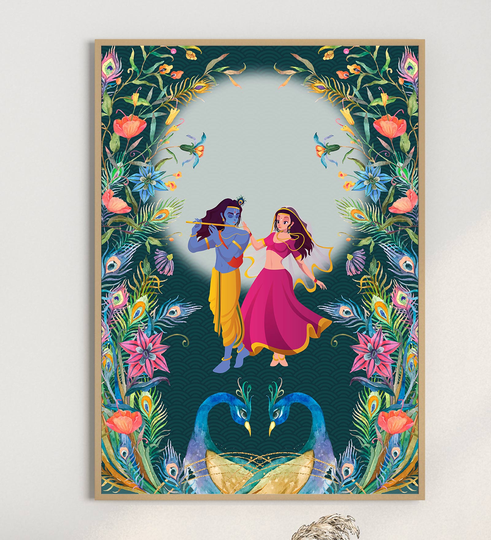
🩷 Feminine Florals or Pastel Murals
Pinks, soft browns, dusty purples—ideal for adding emotional warmth to reading corners or calm zones.
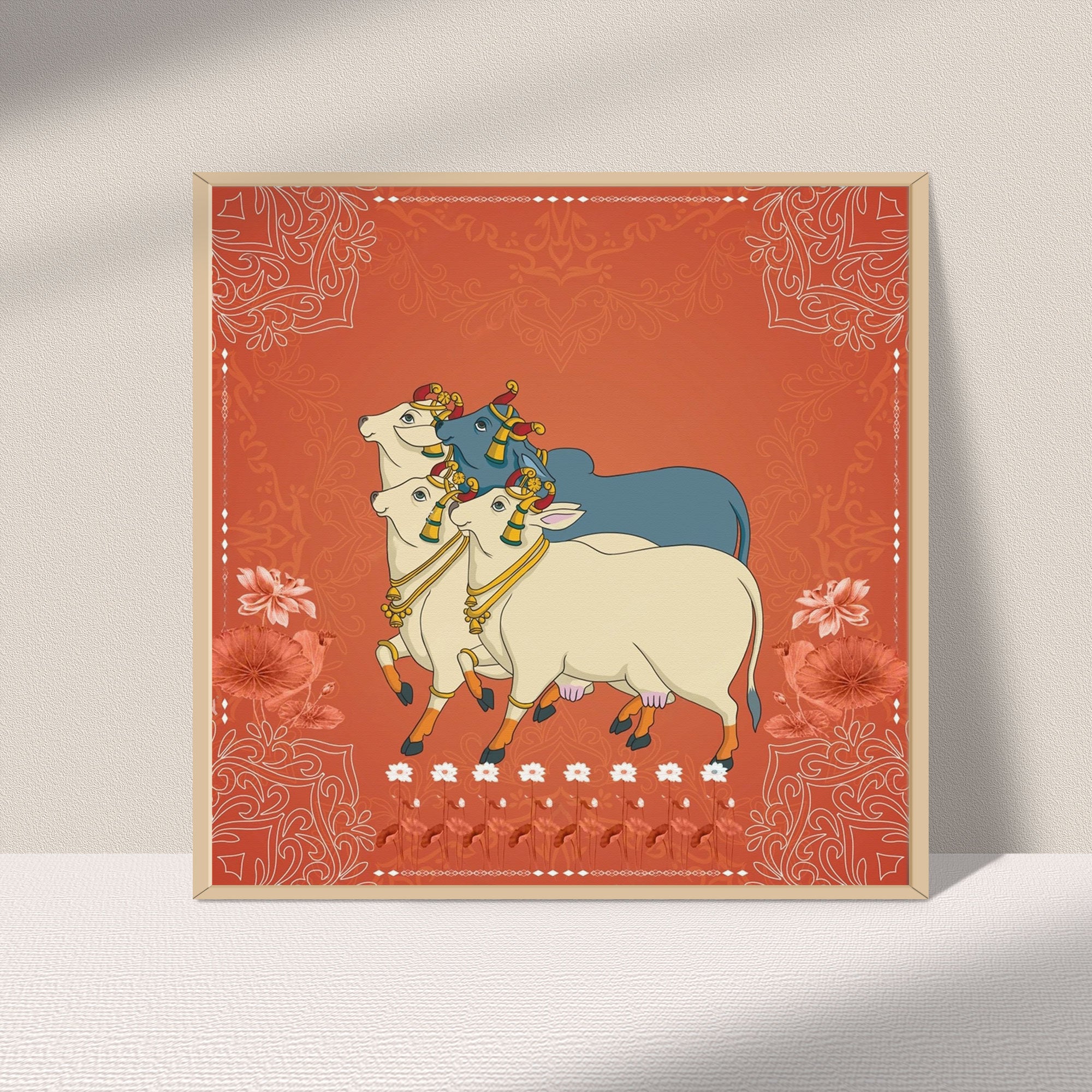
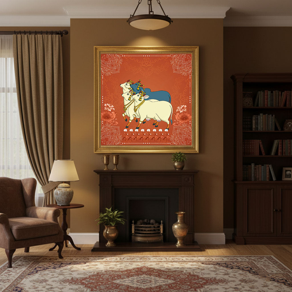
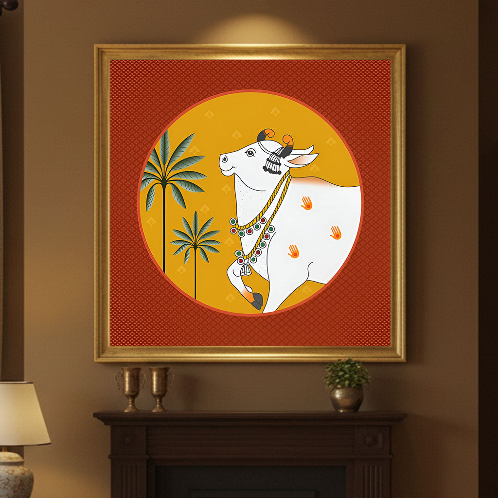
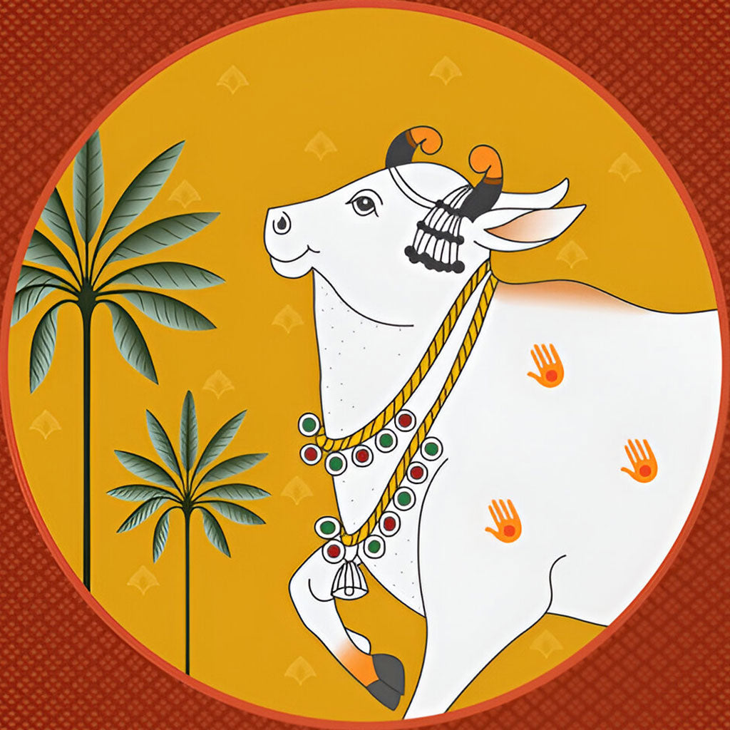
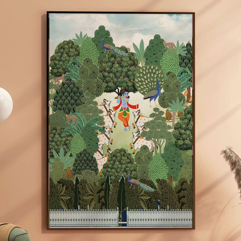
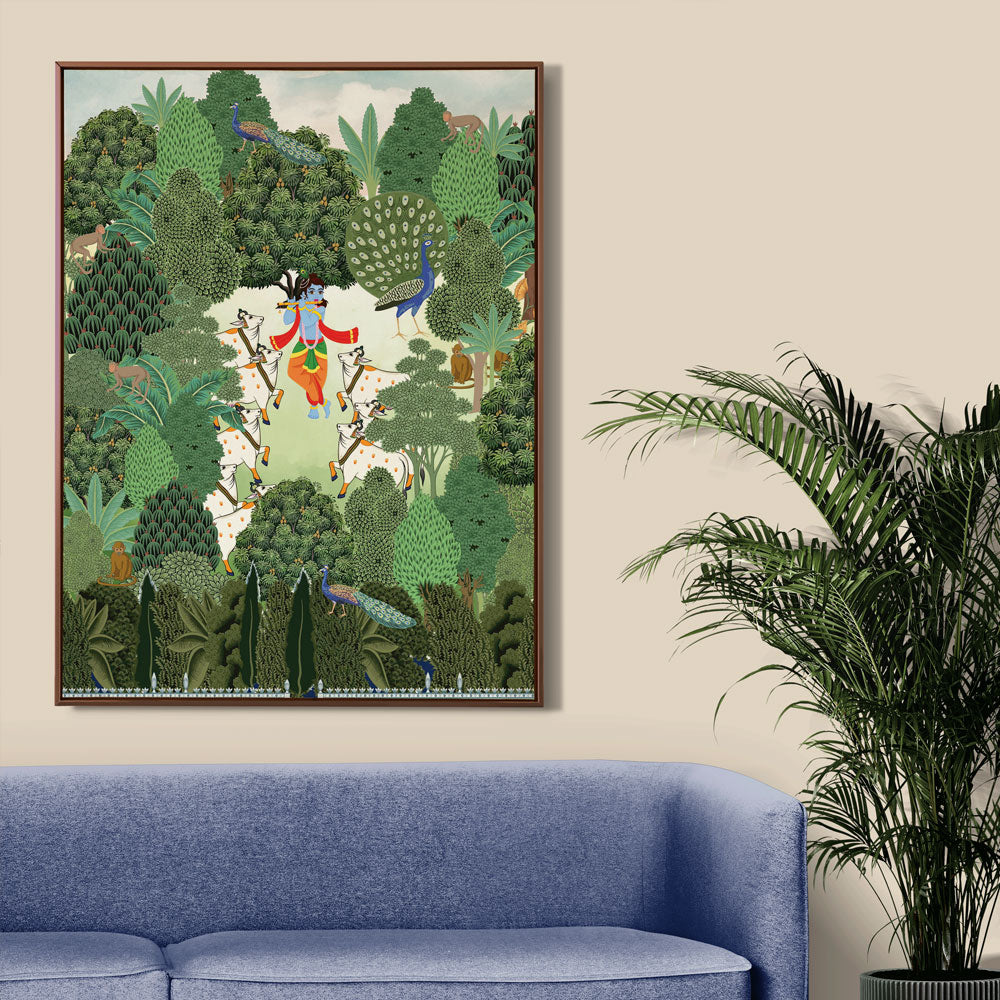
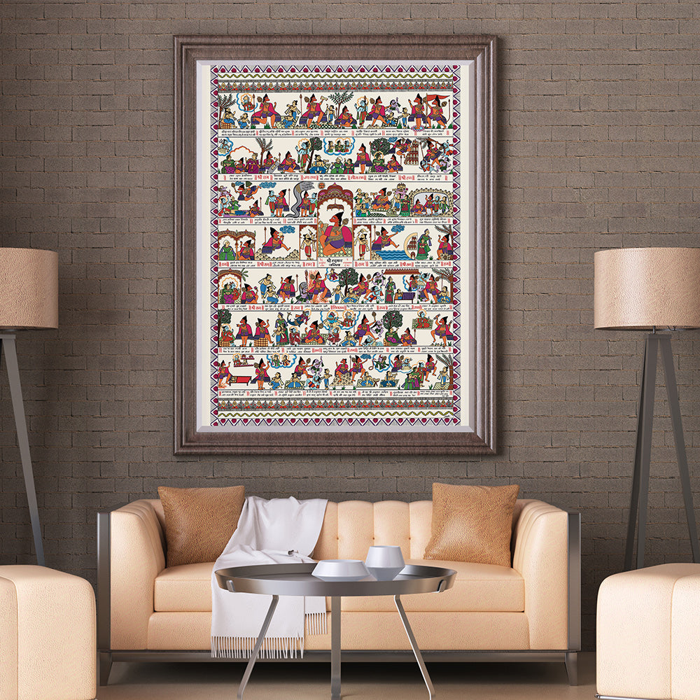
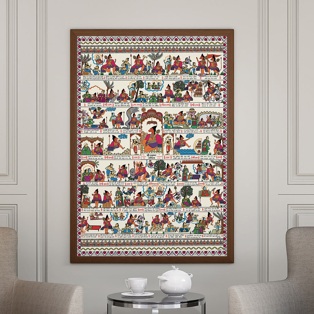
🔥 Bold Pichwai & Traditional Indian Art
Earthy reds, saffron yellows, lush greens—these spark energy and richness in dining or prayer spaces.
Each piece tells a story. And with the right colors, your wall becomes more than a surface—it becomes a portal to feeling.

🌟 How Krutik Uses Color Theory in Every Collection
At Krutik, every painting—whether it’s a sacred Hanuman Pichwai, a soulful abstract, or a serene mandala—is designed with color harmony at its core.
We consider:
-
What space it will live in.
-
What energy it should hold.
-
And how its colors will balance and uplift the surrounding room.
Whether your style is minimalist, boho, spiritual, or luxurious—our collections help your walls reflect mood, story, and soul. The right art doesn’t just fill the space—it transforms it.
All you need is color that speaks to you, and art that understands your story.