The Art of Color Harmony: How to Style Your Space with Confidence
Have you ever stepped into a room that instantly felt… right?
Where the walls, furniture, light, and energy seem to speak the same language?
That feeling isn’t just good design.
It’s color harmony—the quiet art of choosing shades that flow together effortlessly and make your space feel like home.
Whether you're decorating a new home, redoing a corner, or choosing your next piece of wall art, understanding how colors interact can help you style with confidence—and without second-guessing every decision.

🎨 So, What Is Color Harmony?
Color harmony is the idea that certain colors look better together.
Not by accident, but by design.
It’s about balance, contrast, mood, and emotion.
When colors complement one another, the result is pleasing and peaceful. When they clash or compete, the space can feel chaotic, too loud, or just… off.
There are a few core color relationships artists and designers follow:
🟢 Complementary Colors
Colors that sit opposite each other on the color wheel (like blue & orange or red & green).
These combinations pop and energize a space when used in balance.
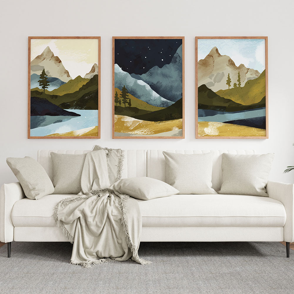
🟡 Analogous Colors
Colors that sit side by side on the wheel (like yellow, yellow-orange, and orange).
They create a smooth, harmonious flow—perfect for cozy, cohesive rooms.
🔵 Monochromatic Schemes
Different shades and tints of the same color family.
This creates minimal, elegant spaces with emotional depth.
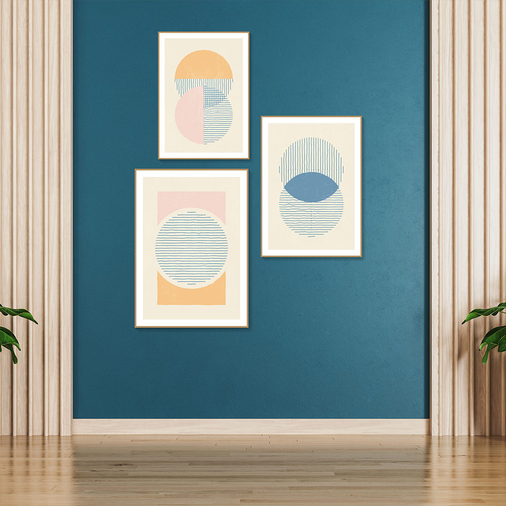
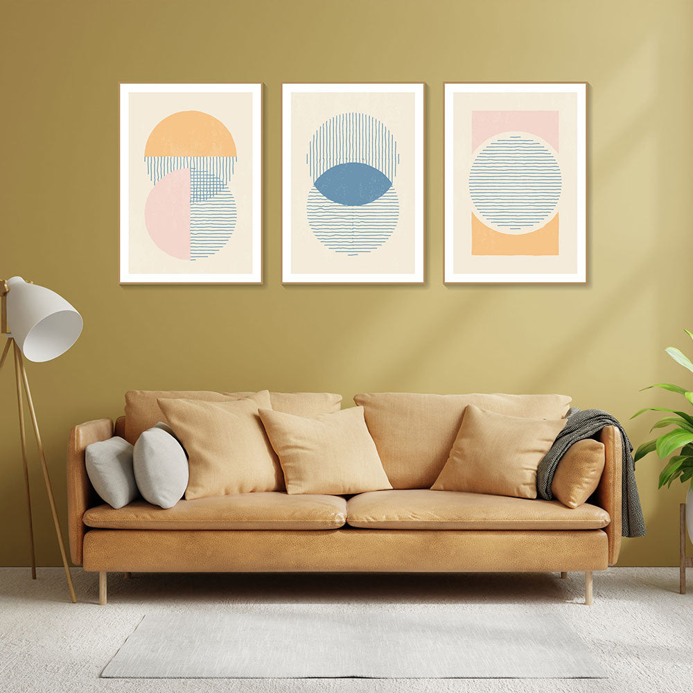
🌈 Triadic & Tetradic Palettes
These are bold combinations using three or four colors that are evenly spaced out on the color wheel.
Ideal for eclectic, artistic, or vibrant spaces.

🧠 How Color Affects Mood
Color isn’t just visual—it’s emotional.
Every hue carries a frequency, a psychological impact. Here’s how they play into your decor choices:
-
Blues & Greens – Calm, trust, peace. Great for bedrooms, meditation spaces, or tranquil corners.
-
Yellows & Oranges – Joy, warmth, energy. Lovely for kitchens, dining areas, or creative spaces.
-
Reds & Deep Purples – Passion, richness, drama. Use carefully in living rooms or bold accent walls.
-
Neutrals (Beige, Taupe, Greys) – Balance, openness, sophistication. These support and ground bold art or furniture.
-
Black & White – Power, contrast, clarity. Best used as grounding elements to anchor a space.

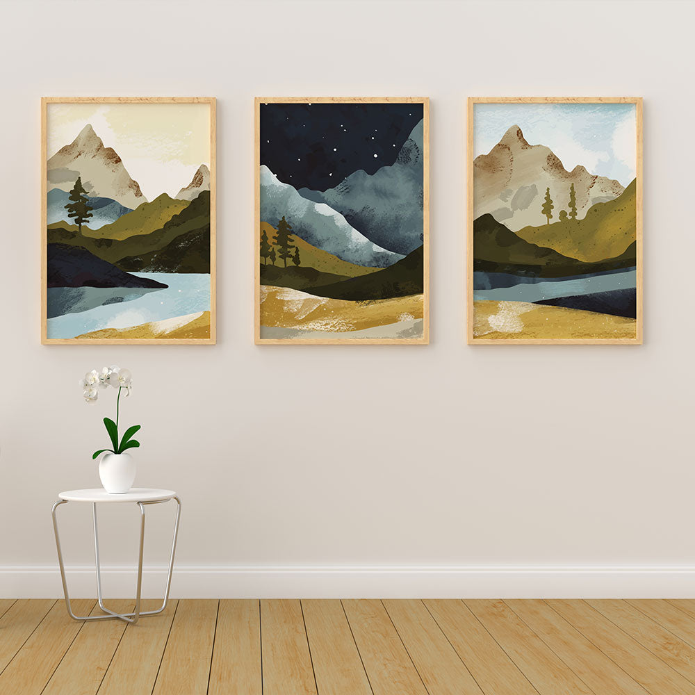
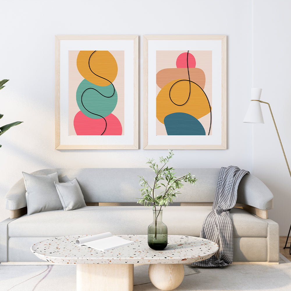
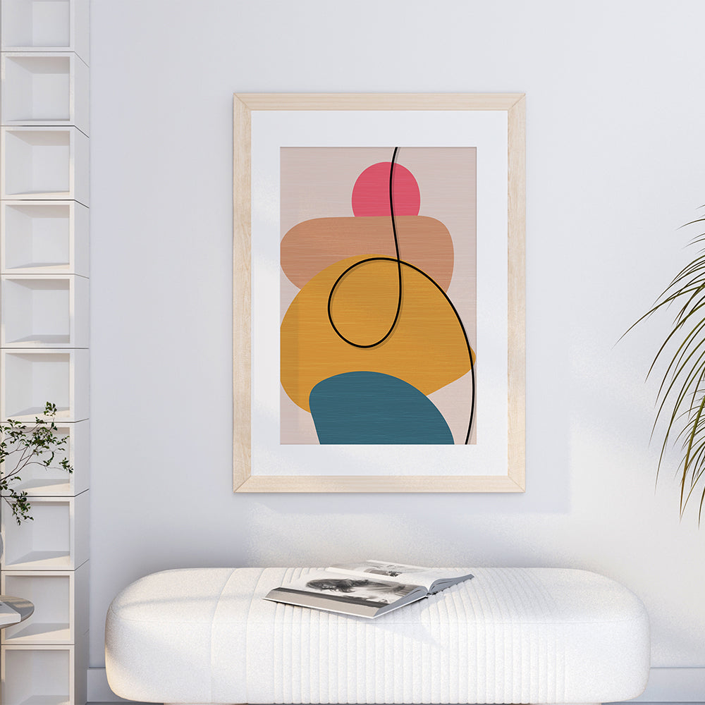
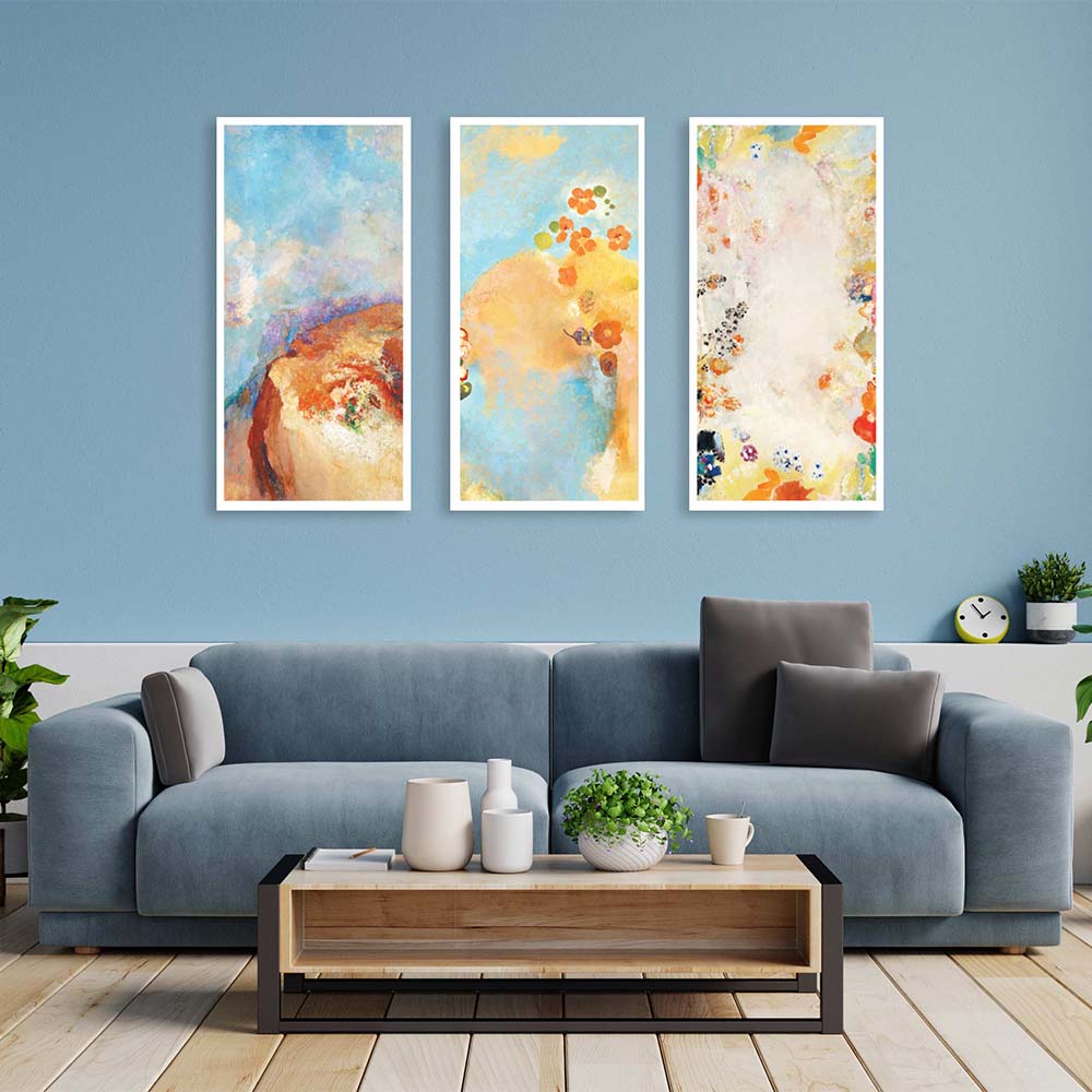
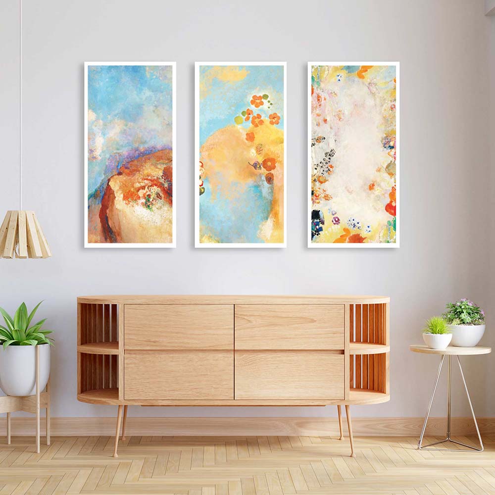
🖼️ How to Use Color Harmony in Choosing Art
One of the easiest (and most impactful) ways to bring harmony to a room is through wall art.
But it’s not just about matching your sofa.
Ask yourself:
-
Do I want my art to blend in or stand out?
-
Do I want it to energize the room or soften it?
-
What emotion do I want to feel every time I look at it?
The right piece should either echo your room’s palette or complement it in a balanced contrast.
For example:
-
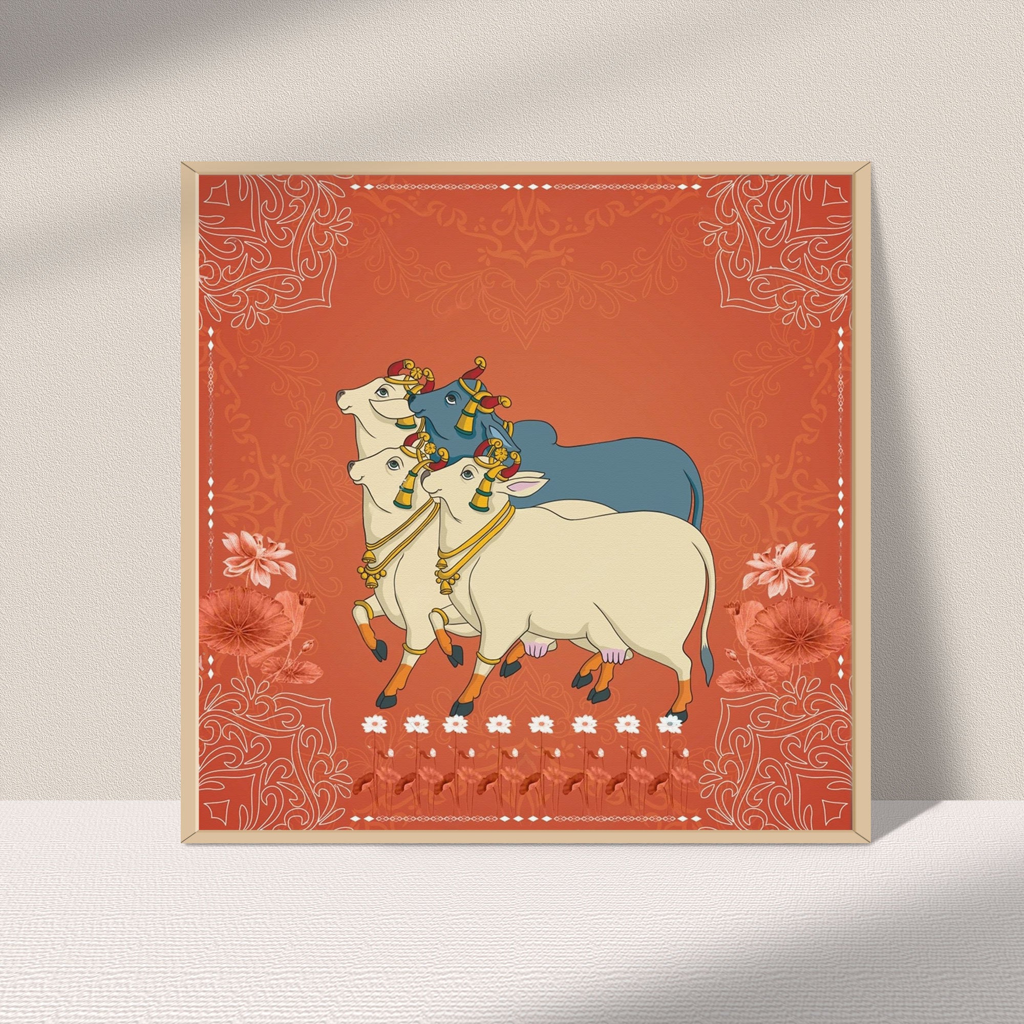
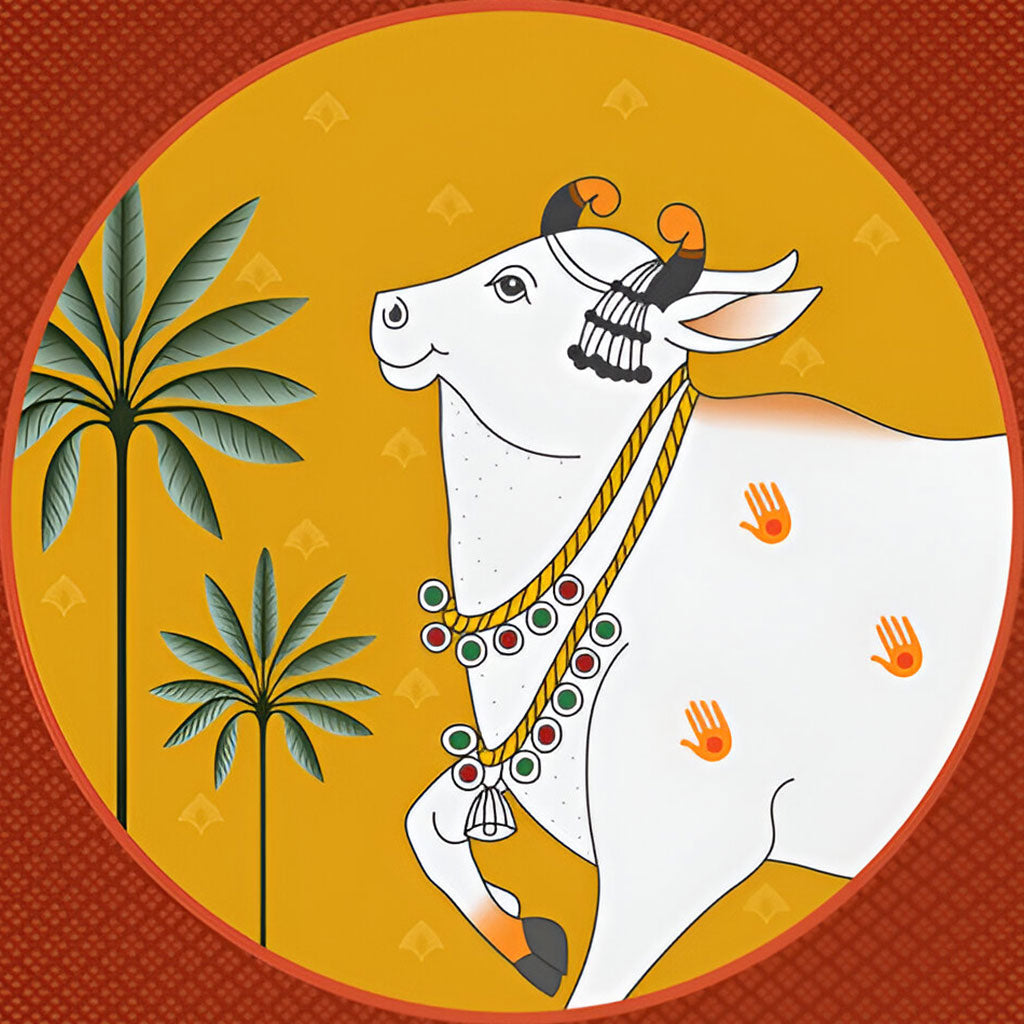
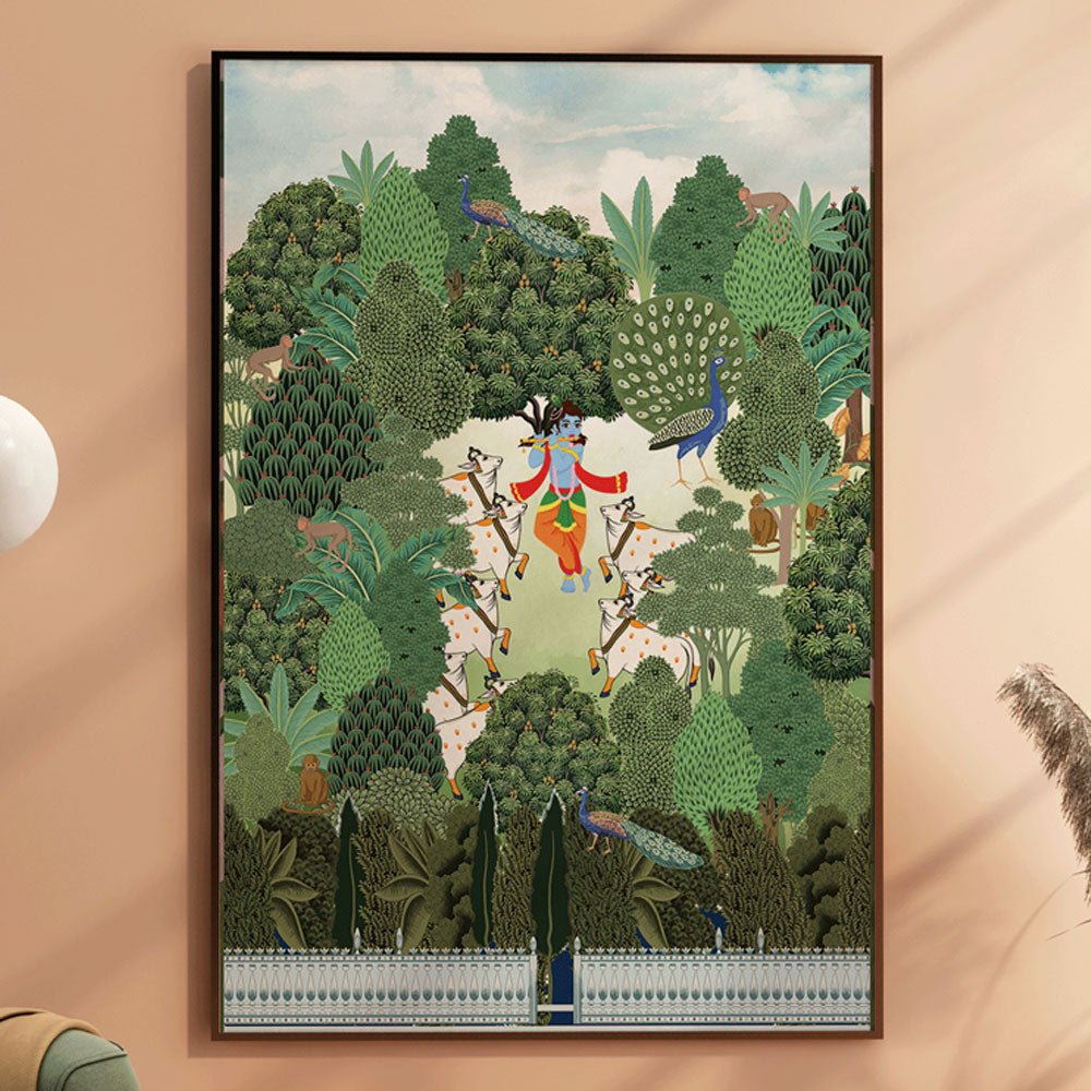
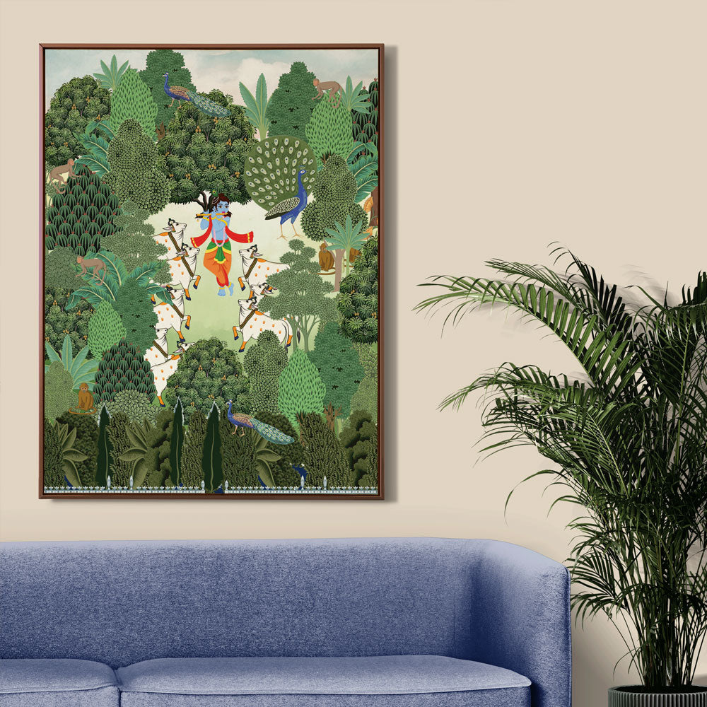
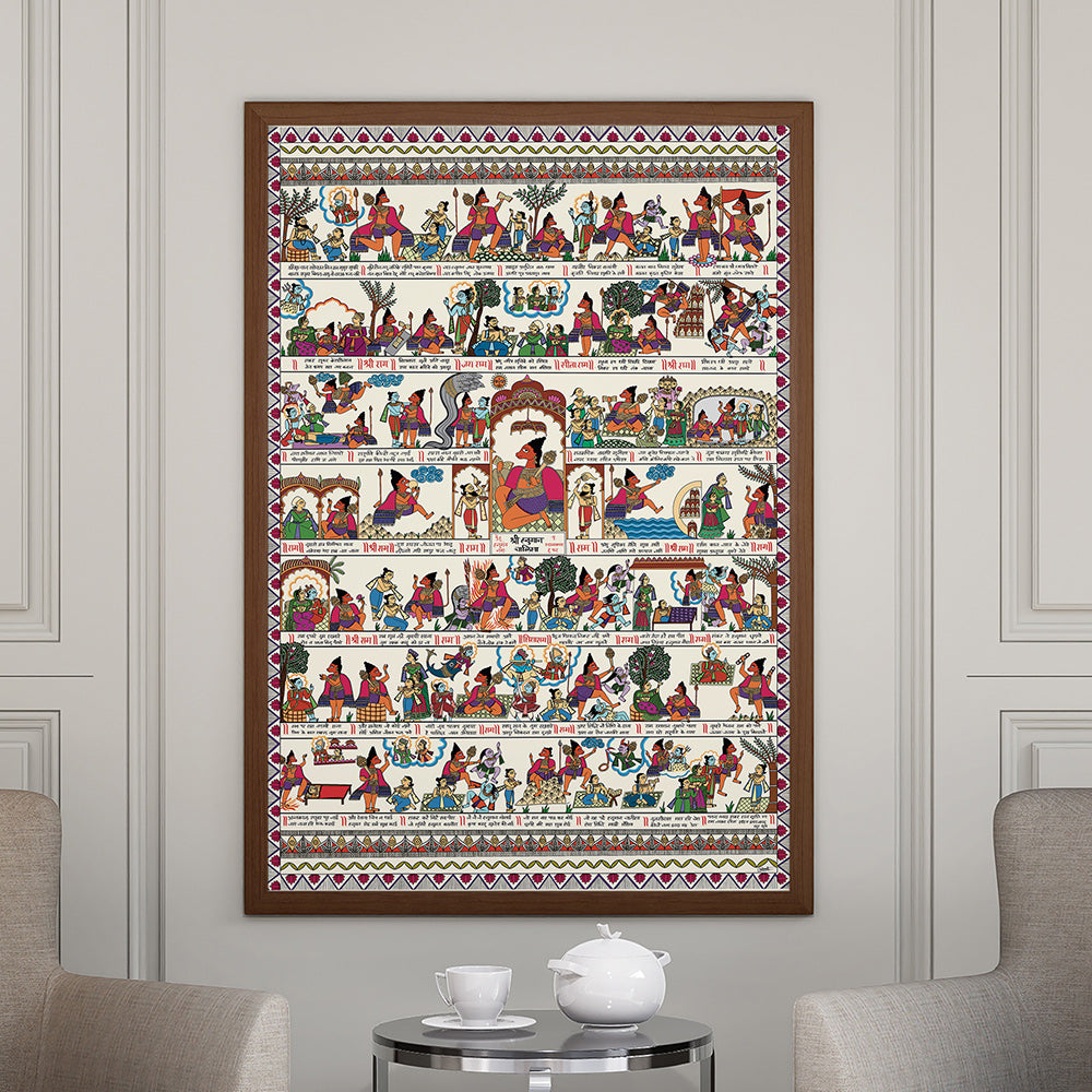
A cool-toned space with white and grey walls comes alive with Krutik’s warm floral murals or vibrant Pichwai art.
-
A neutral boho corner welcomes a mandala painting in earthy tones, creating grounded serenity.
-
A minimal modern space can find focus with a bold abstract piece that ties the room together emotionally.
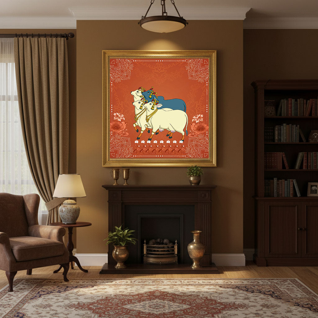
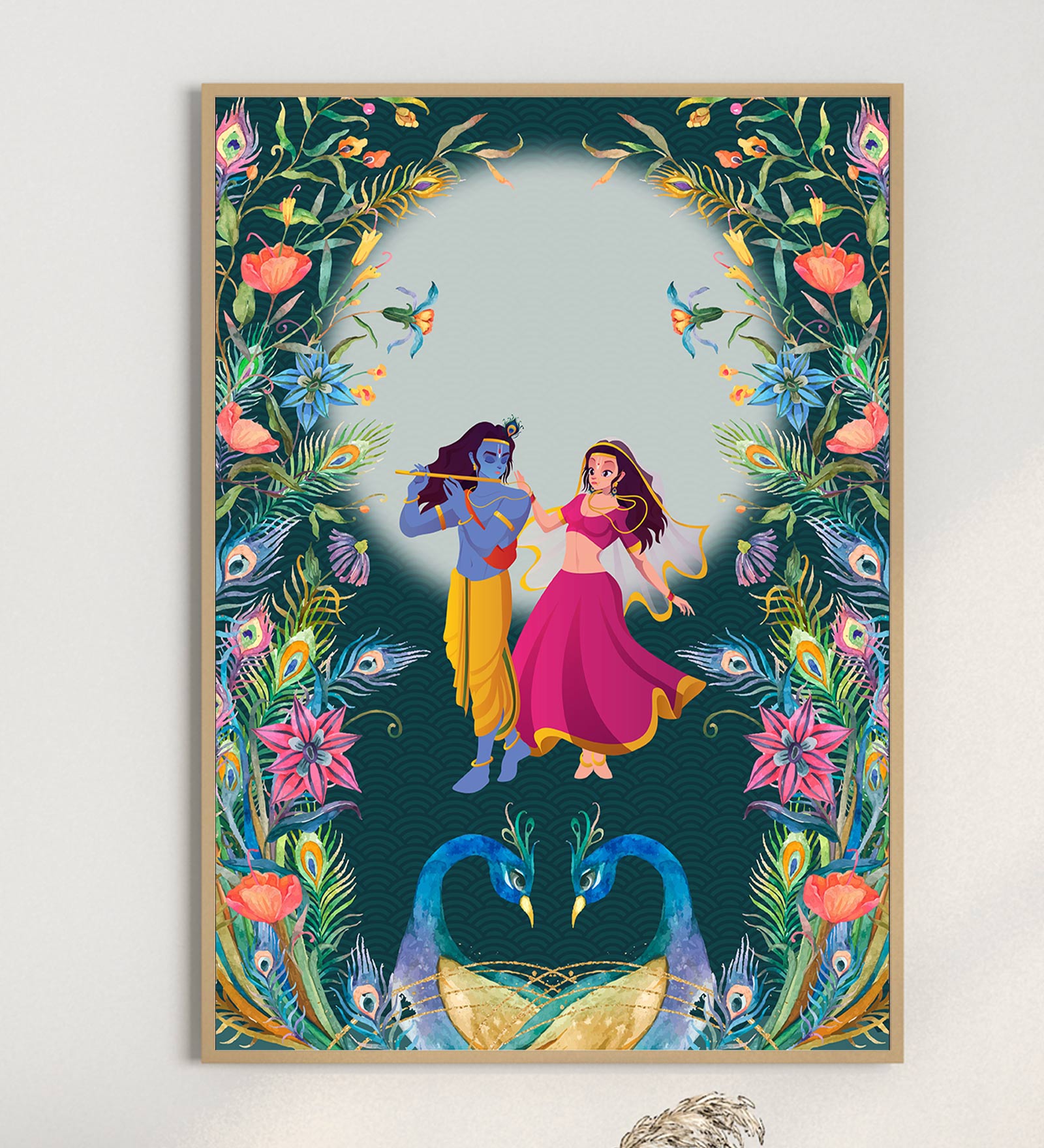
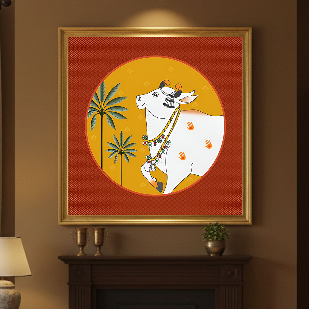
🌟 At Krutik, Color is Our Language
Every collection at Krutik is thoughtfully crafted not just for aesthetic appeal—but for emotional resonance.
We deeply study color harmony so that whether you’re choosing a cosmic mural, feminine painting, mandala, or a celestial abstract, your space feels balanced, alive, and intentional.
Our goal isn’t to just sell art.
It’s to help you create a space that feels like you.
So whether you gravitate toward calming pastels or rich, regal hues…
...we have a piece that fits your palette—and your personality.
👉 Explore color-balanced art at www.krutik.in
Let your walls speak harmony. Let your space feel like home.